

By Jana Love
Hey, check out what’s “new” with ProSolutions! Over the course of 2 years (much longer than we thought), we have been working on a re-brand. This is the second re-branding experience that we have taken ourselves through in our “almost” 30-year run. These experiences give you permission, and require you, to explore the “what if’s.” What if we told our story in a different way, what if we brought in fresh new colors into our look, what if we changed our logo, what it we simplified, what if….
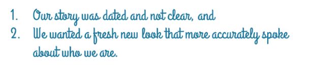
Having been here for the last 30 years, constantly testing my entrepreneurial skills as a business person, what has been in my rearview mirror is always fun for me to reflect on. The main reasons that we decided on the re-brand was two-fold:
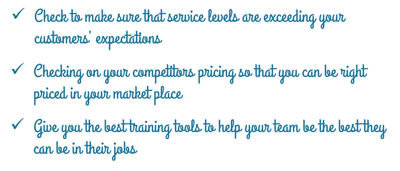
Landing on the logo was easy. I love the simplicity of it and the focus on the check mark because it speaks so clearly to what we do:
So why are we re-branding? Well, I feel ProSolutions is made up of forward-thinkers, and we believe in growth and improvement not only for our customers, but for ourselves. As part of this, we felt a more current look with fresh new colors would fit the bill. Going with this color scheme has taken us from very high contrast colors (gold and maroon) to a much more flexible scheme where we can do pops of colors on top of our calming and professional blue. To us, this blue represents trust, dependability, loyalty, intelligence and stability. All of which we care deeply about.
Also, our desire to keep the site simple and understandable for our customer was accomplished by putting our services in 3 major buckets: Mystery Shopping, Pricing, Training & Certification. What I love about this approach is that it tells a clearer story of us and what we do. It’s us, new and improved!